Astoria AI
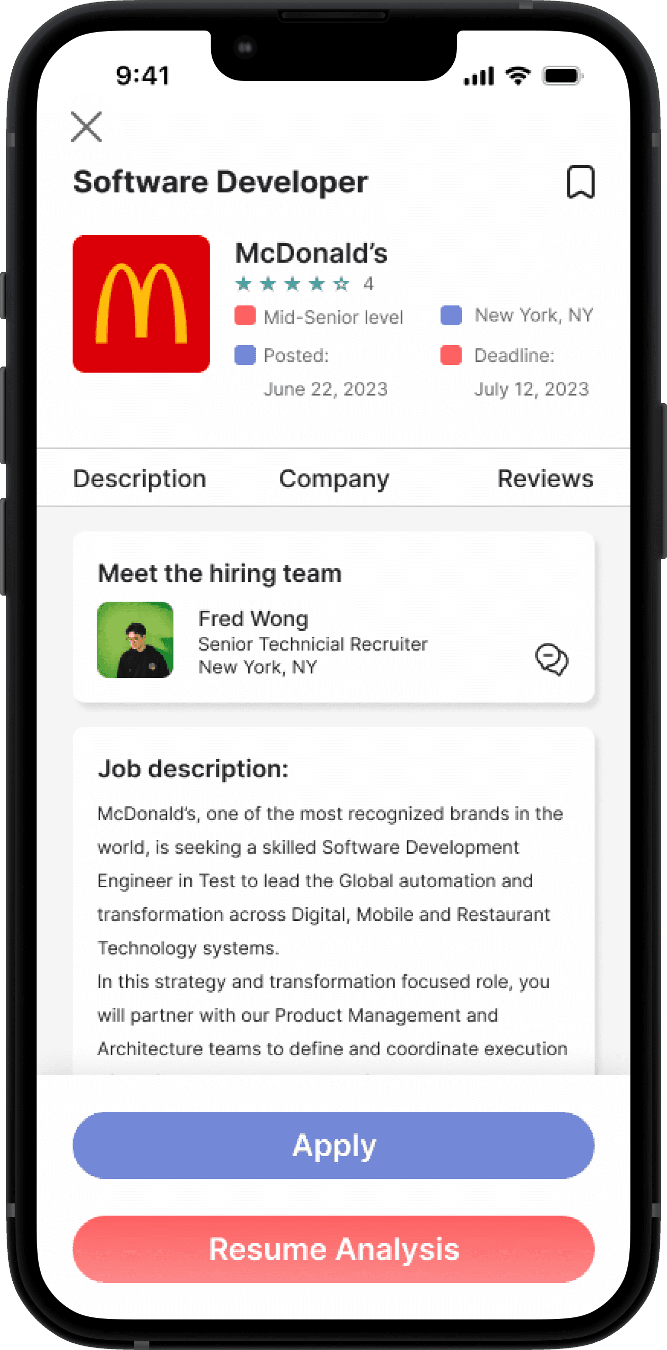
An AI company that helps job seekers to match the right jobs and assist job recruiters to find the right candidates.
Overview
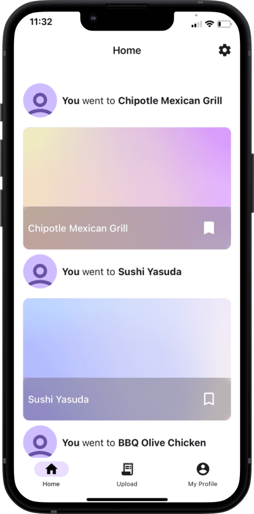
Splyt Pay is a company that offers users to split their restaurant bills. Splyt helps users to create collections of beautiful moments that they can share with their family and friends creating lasting memories. The moderator creates a bill that allows participants to join and pay their dinner bills.
Problem
Users find that the app lacks consistency in the visual presentation of the UI screens. When a split was created, moderators were not aware that items could be edited. They don't have a way to see what everyone is paying in total. Participants are paying too early, which causes the participant to pay the wrong amount when the other participant has not been selected yet.
Solution
Redesigning the UI screens and keeping them consistent and minimalistic. Create an intuitive UI screen that allows users to edit their items and add extra fees. The moderator will be allowed to see who claims items and the total pay for each participant. We create a screen for moderators to control, edit, delete, and assign items to participants.
Duration
6 weeks
Roles
UX/UI Designer (Team of 5)
Process
User Flows
Style Guide
Wireframes
UI Iterations
High fidelity screens
Prototyping
Developer Handoff
Solution
Figma
Figjam
Google Drive
Slack
Zoom
Discovery
Kick-off meeting
After a brief introduction, our team dives right into the scope of the project. We discussed and analyzed the incoming deliverables as well as the due dates on Zoom. In the scope, the client requests a redesign of their mobile app, including applying clean and modern designs that solve the problems of the current, existing app. During the call, we create questions for the client to get a better understanding of the function and concept of the app.
After the kick-off meeting, the client has to answer all the questions, and here are the important findings:
The home page provides transactions and restaurants. Only the moderator has access to their own bills.
Like modern designs.
Need to create an account.
No "pay later" option.
Avoid multiple QR codes.
Client Questions & Answers
We conducted a heuristic evaluation of the current existing app. This is a screenshot of the current app for the home page. We were able to identify the visual hierarchy, but the function of the app was not intuitive for users. We strategize the current issues and create plans to redesign for a more intuitive design for the users.
Heuristic evaluation
Ideation
User stories
The client provides us with the user stories. Here are the user stories:
As a user (Moderator), I want to create a profile and log in.
As a user (Moderator), I want to learn how to use the Splyt Pay app.
As a user, I want to learn how to create a splyt
As a user, I want to learn how to invite others to join the splyt
As a user (Moderator), I want to create a splyt.
As a user (Moderator), I want to see the details of a split.
As a user, I want to see what everyone selected.
As a user (Moderator) I want to see how much everyone owes me.
As a user (Moderator), I want to see my previous splyts.
User Flow
We created the user flow based on the user stories. The user flow is mainly for moderators and first-time users. After the reviews from the client, we revised the user flow and created more flows to incorporate an intuitive way for users to finish their task easily.
Wireframe
Based on the user flow, we created wireframes for all the flows through Figma. After the client's review, our team collaborated to find the best designs that have the best practice for users' needs. I specifically worked on the structure and design of the wireframes. After applying the style of team members, this is the final iteration of the wireframe.
Design
Our team collaborated and went through many inspirations and thoughts to create colorways of blue and purple. It represents a modern, trustworthy, and royal. We want users to feel the colorway, as the app represents a sense of these attributes.
Mood Board
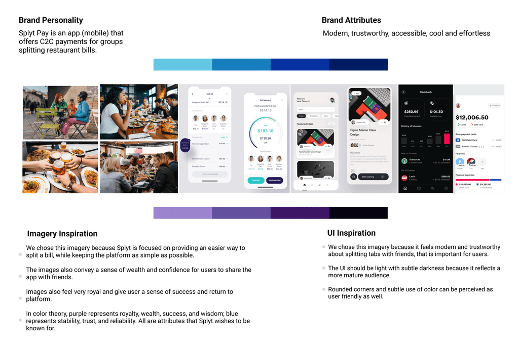
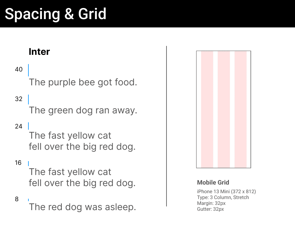
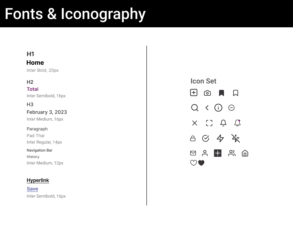
After experimenting with different colors in the wireframes, our team decided to create a color palette focused primarily on purple and blue, incorporating a linear gradient that mirrors the Splyt logo to maintain brand consistency. We selected the Inter font for its simplicity and minimalistic style, ensuring a clean and modern look. The icons were chosen for their intuitive visual appeal, aligning with our commitment to a minimalistic design. Additionally, we ensured that all components were scalable and focused on accessibility, providing an inclusive user experience while maintaining design consistency across the platform.
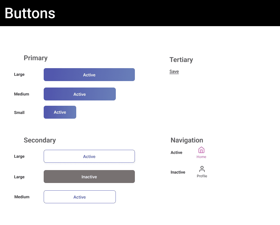
Style guide

UI iteration
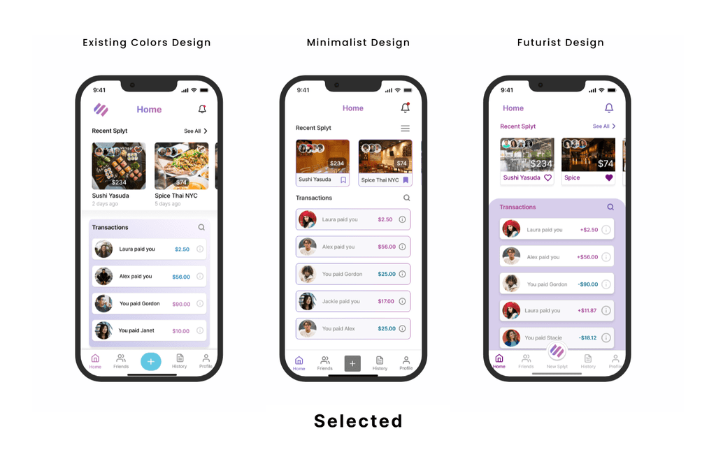
We created three variants of the UI designs for the client to decide on the final iteration of the design. Each team member worked on different screens. I specifically work on the existing color designs. Although the client picked the minimalist design, I learned to incorporate the minimalist design to produce the best practice and intuitive for the client's needs.
High fidelity screens
When the client chose the minimalistic design, our team worked together to finalize it and apply colors from the style guide to enhance visualization. During the process, we tried many iterations of colorways to find the one that best fits the design. For the home screen, our team discussed changing the restaurant cards into a more modern design. My contribution was to make sure all the colors and designs matched the client's aesthetic and at the same time looked modern and minimalistic.
Prototype
After finalizing the high-fidelity screens, our team gathered all the screens in order. I took all the high-fidelity screens to connect them to make sure all the buttons and screens functioned correctly according to the flows. We worked together to build the mobile website flow. My contribution was creating a prototype for the new user flow and the moderator flow.
Developer Hand-off
Our team created the developer hand-off to show the spacing, meaning of the color, and functionality of the buttons. Throughout this process, I developed skills to create a developer hand-off that is easily readable for developers.
Developer/Client Hand-off
